

We have an idea for a digital solution to support recovery after stroke and other neurological conditions — using AI-powered, personalized therapy. Now we need a platform that’s not just functional, but also feels warm, human, and encouraging — giving users a sense of clarity and calm as they move through recovery.

Anna Schöllauf
Product Owner
We have an idea for a digital solution to support recovery after stroke and other neurological conditions — using AI-powered, personalized therapy. Now we need a platform that’s not just functional, but also feels warm, human, and encouraging — giving users a sense of clarity and calm as they move through recovery.
Anna Schöllauf
Product Owner
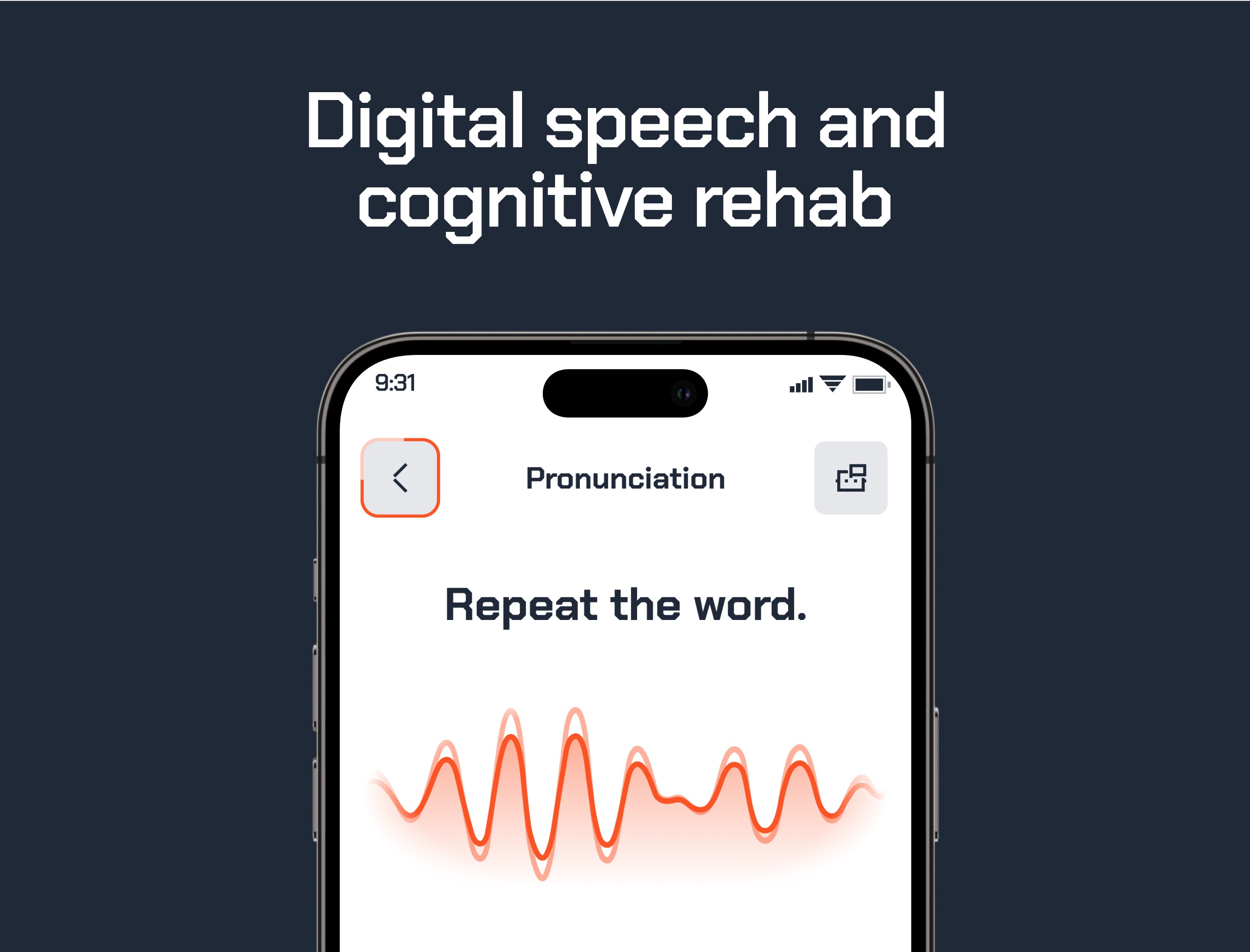
Mendora is a digital health platform focused on AI-driven therapy for neurological recovery. It offers personalized, interactive rehabilitation exercises tailored to each patient’s needs, supported by real-time progress tracking and clinician tools. By combining advanced technology with medical expertise, Mendora helps streamline cognitive and speech therapy—making recovery more accessible, engaging, and effective both in clinics and at home.
Mendora is a digital health platform focused on AI-driven therapy for neurological recovery. It offers personalized, interactive rehabilitation exercises tailored to each patient’s needs, supported by real-time progress tracking and clinician tools. By combining advanced technology with medical expertise, Mendora helps streamline cognitive and speech therapy—making recovery more accessible, engaging, and effective both in clinics and at home.


Creative Direction
For the visual identity, we focused on creating a bold yet empathetic atmosphere — one that supports users on their recovery journey without feeling clinical or cold. The goal was to strike a balance between medical reliability and emotional warmth, delivering a design that feels both intelligent and human.
Typography plays a key role in establishing this tone: geometric letterforms in Archive create a sense of structure, while vibrant color blocks — like Blaze Orange and Power Blue — add energy and positivity. The emotion-driven interface elements helping users feel seen and supported throughout the experience. The overall system is designed to be both clear and uplifting, with clean layouts and a confident, modern visual language that builds trust and encourages engagement.

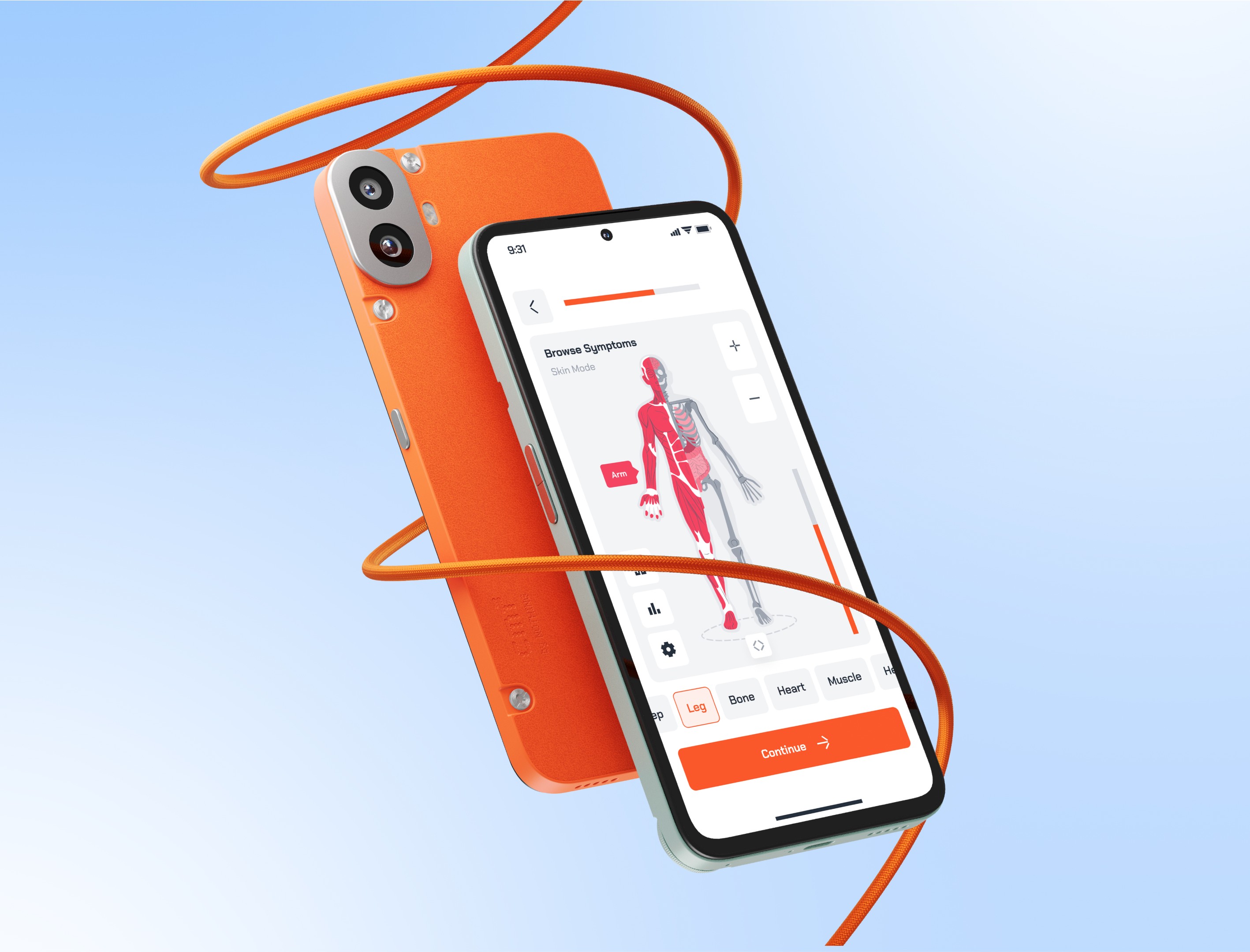

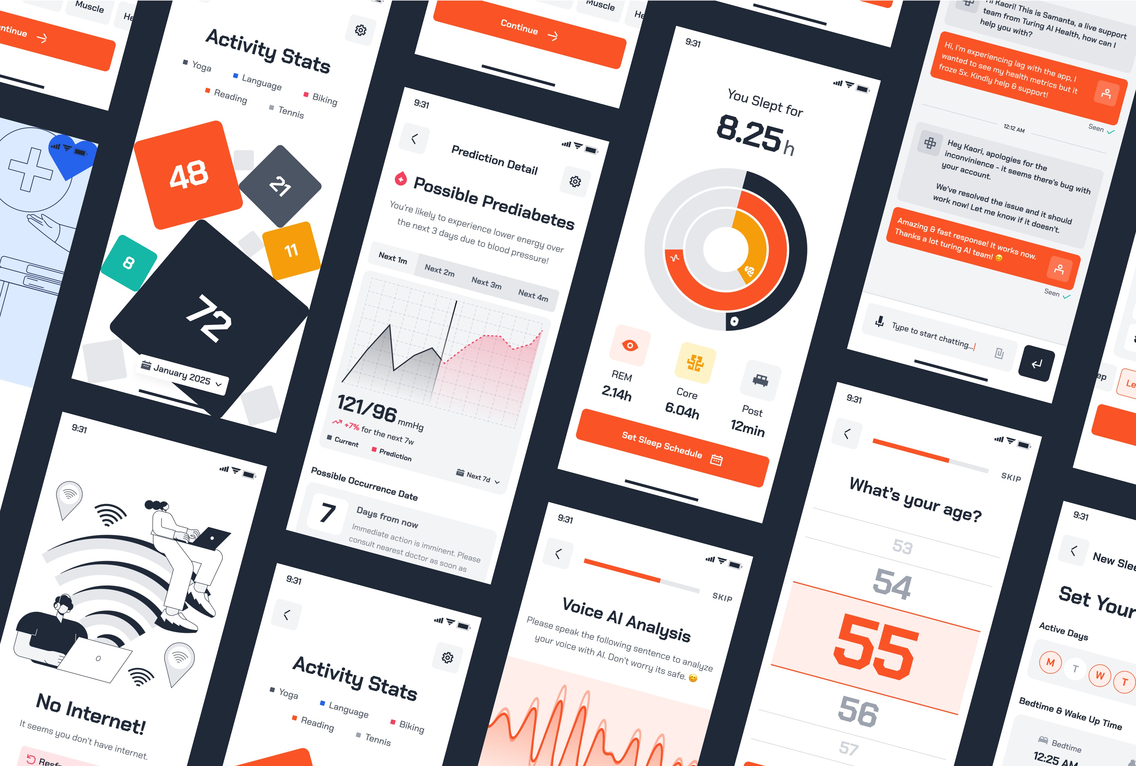
Interface
We crafted a visual language that bridges the app’s interface with its core functionality — creating a supportive, clear, and intuitive experience that not only informs but actively guides users through their health and recovery journey.
We focused on clarity and ease at every step — using light backgrounds with sharp contrasts to support users with visual strain, and reducing navigation to just a few key actions for those with limited focus or motor control. Clean typography, bold accents, and intuitive flows make health data feel simple, not overwhelming. Everything is designed to make recovery approachable, effective, and personal.


Latest projects
Branding
Web Design
Radiant skincare branding
Radiant skincare is offering a user-centric, ad-free platform.

Branding
Web Design
Radiant skincare branding
Radiant skincare is offering a user-centric, ad-free platform.
Branding
Development
Apex clothing Co. rebrand
Bold new look for an eco-conscious apparel brand.

Branding
Development
Apex clothing Co. rebrand
Bold new look for an eco-conscious apparel brand.
